| Module | Name | Version | License | Source | Languages | Platforms | Type | Author | Description |
|---|---|---|---|---|---|---|---|---|---|
| QTCfg | Program configurator (Qt) | 4.2 | GPL2 | ui_QTCfg.so | en,uk,ru,de | x86,x86_64,ARM | UI | Roman Savochenko Maxim Lysenko (2009) — the page translation |
Provides the Qt-based configurator of OpenSCADA. |
The module provides the configurator of OpenSCADA, which based on the multi-platform library Qt of the graphical user interface (GUI) of initially created by the firm TrollTech.
The module is based on the control interface language of OpenSCADA, which means providing a single configuration interface. Update of the module may be required only in the case of updating the specification of the control interface language. To query the page context, group query of the control interface is used, which allows you to optimize the time of remote access on high-latency and slow communication channels.
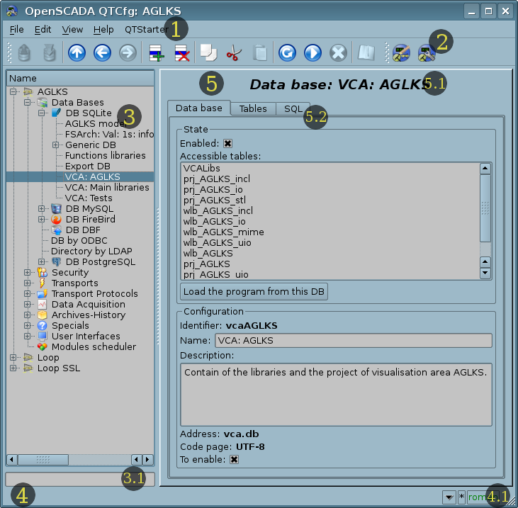
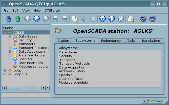
Let's examine the working window of the configurator in Figure 1.
The operating window of the configurator consists of the following parts:
- 1 Menu — contains the drop-down menu of the configurator.
- 2 Toolbar — contains quick control buttons.
- 3 Navigator — designed for direct navigation by the control tree.
- 3.1 Text entry field to search for an item in the current tree branch.
- 4 Status line — indicating the configurator status with a button calling the status history.
- 4.1 Indicator/choice of the user — displays the current user, by double-clicking the user selection dialog opens. Contains also an indicator of changes in the configuration.
- 5 Workplace field — divided to parts:
- 5.1 Node name — contains the current node name.
- 5.2 Tabulator of the working areas — the root pages (control areas) of the node are placed into the tabulator. The control areas of the following levels are placed on the main control place.
Menu of the configurator contains the following items:
- File — group of the general commands:
- Load from the DB — loads the selected object or branch of the object from the database.
- Save to the DB — saves the selected object or branch of the object to the database.
- Close — closes the configurator window.
- Quit — quits OpenSCADA.
- Edit — editing commands:
- Add — adds a new object to the container.
- Delete — deletes the selected object.
- Copy item — copies the selected object.
- Cut item — cuts of the selected object. The original object is removed after paste.
- Paste item — pastes of the copied or cut item.
- View — navigation and control of the view commands:
- Up — goes to the parent page.
- Back — goes back to the previous page.
- Forward — goes forward to the forward page.
- Refresh — refreshes the current page.
- Start — runs periodically update of the current page content with an interval of one second.
- Stop — stops periodically update of the current page content with an interval of one second.
- Help — assistance call commands:
- About — information about this module and OpenSCADA.
- About Qt — information about the Qt library.
- Manual on 'QTCfg' — calls inline or offline manual on the module QTCfg.
- Manual on 'OpenSCADA 0.9' — calls inline or offline index of links to documents and manuals on OpenSCADA.
- Manual on the page — calls inline or offline manual on selected page.
- What's This — requests information for the interface elements and receive their full contextual help.
The toolbar contains the following management buttons (from left to right):
- Load from the DB — loads the selected object or branch of the object from the database.
- Save to the DB — saves the selected object or branch of the object to the database.
- Up — goes to the parent page.
- Back — goes back to the previous page.
- Forward — goes forward to the forward page.
- Add — adds a new object to the container.
- Delete — deletes the selected object.
- Copy item — copies the selected object.
- Cut item — cuts of the selected object. The original object is removed after paste.
- Paste item — pastes of the copied or cut item.
- Refresh — refreshes the current page.
- Start — runs periodically update of the current page content with an interval of one second.
- Stop — stops periodically update of the current page content with an interval of one second.
- Manual on the page — calls inline or offline manual on selected page.
- Call buttons of the graphical interface modules of OpenSCADA based on the Qt library
In the navigation tree the context menu of following contents is supported:
- Load from the DB — loads the selected object or branch of the object from the database.
- Save to the DB — saves the selected object or branch of the object to the database.
- Add — adds a new object to the container.
- Delete — deletes the selected object.
- Copy item — copies the selected object.
- Cut item — cuts of the selected object. The original object is removed after paste.
- Paste item — pastes of the copied or cut item.
- Refresh the items tree — refreshes the navigation tree content.
The control elements are divided to: basic, commands, lists, tables and images. All items are displayed in the sequence strictly appropriate to their location in the description of the control interface language.
1 Configuration
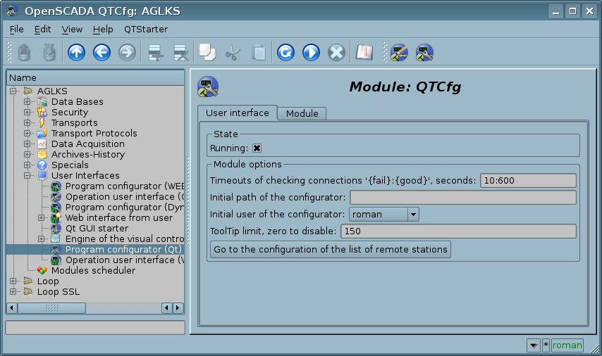
In order to customize its own behavior in some cases, the module provides the ability to configure the parameters through the control interface of OpenSCADA (Fig.2). These parameters are:
- Timeouts of checking connections "{fail}:{good}" — sometimes (for the SSH tunnel), it is useful to reduce the connecting timeout up to 30 seconds to keep the connection.
- Initial path of the configurator — allows to determine what local page to open when you start the configurator.
- Initial user of the configurator — points on behalf of the which user to open configuration without requiring a password.
- ToolTip limit in chars to prevent of big emerging help windows, by default 150. Set zero for disable.
- Go to the configuration of the list of remote stations of OpenSCADA, which is used to provide the remote configuration.
Vertically scalable fields (list, text, and table) provide automatic scaling for available space and field contents. In addition, they have the ability to manually change their height by snapping and dragging the bottom of the widget, which, however, does not work for all Qt widget styles.
2 Basic elements
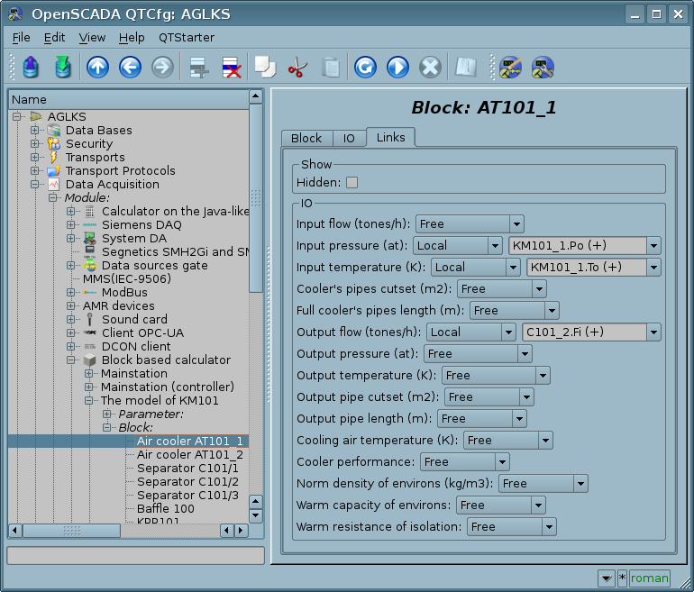
Into the number of the basic elements are included: information elements, the field to input values, the elements of combo box, flags, text fields. In the case of absence of an element name, the basic element connects to the previous basic element. Examples of the basic elements with the connection is shown in Figure 3.
For input elements that do not provide immediate changes and can be edited for a long time before final completion, a confirmation mechanism is provided. This mechanism eliminates the delay when editing, especially in the case of the remote stations configuration, and to make changes on the confirmation. The input elements with confirmation include: fields for entering text strings or numerical values and text fields. Confirmation is made by pressing the button that appears next to the input field after the start of editing.
Text fields also support syntax highlighting, the rules are transmitted in the form of regular expressions from the control interface.
3 Commands
The commands are the elements of transferring of certain instructions of an action to the node and for organization of links-transitions on other pages. Commands may contain parameters. The parameters are formed from the basic elements. Example of the commands with the parameters is shown in Figure 4.
4 Lists
The lists contain a group of basic elements of the same type. Operations under the elements are accessible via the context menu of the list. Through the elements of the list can be performed the moving operations to other pages, mostly children. The transition is implemented by double-clicking of the mouse on an element of the list. Lists can be indexed. An example of the list is shown in Figure 5.
5 Tables
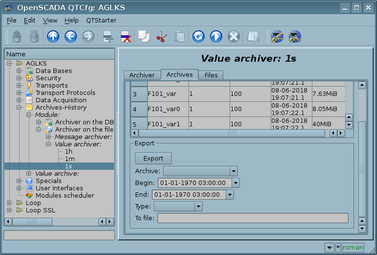
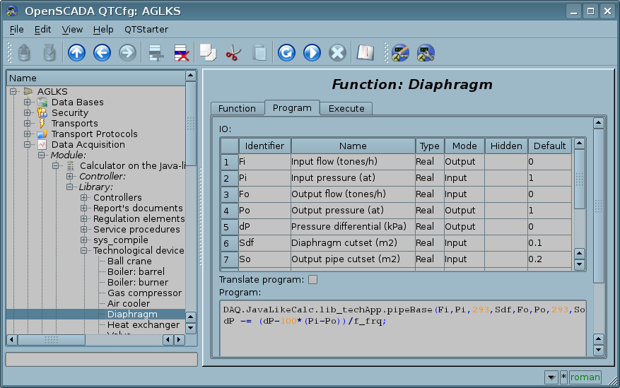
The tables contain values of the basic elements. Type of the basic element is an individual for each column. Example of the table is given in Figure 6. Operations on the structure of the table for editable tables are accessible through the context menu. Editing of the table is done by double-clicking on the desired cell.
6 Images
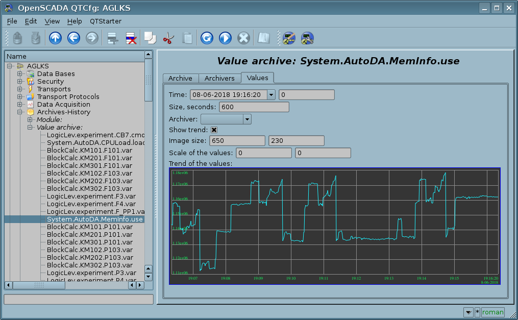
The images are designed to transmit graphic information into the configurators. Example of the image is shown in Figure 7.
